
Optical alignment
November 20, 2025
·0views
In design, alignment comes in two forms: mathematical and optical.
Early in my career, I assumed everything had to be mathematically perfect. But you quickly notice situations where the perfect numbers just don’t feel right.
Over time, I’ve started to catch on a few quick wins that make an interface look & feel more intentional.
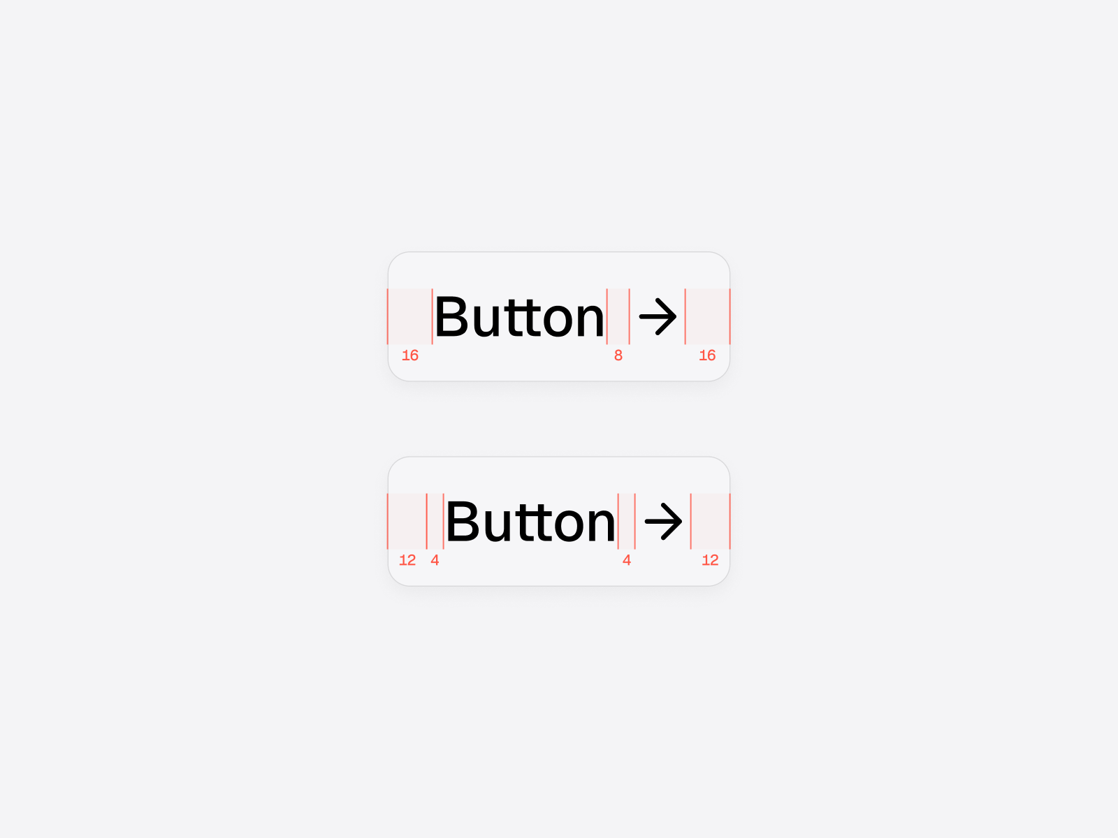
Adjusting horizontal padding for icon buttons
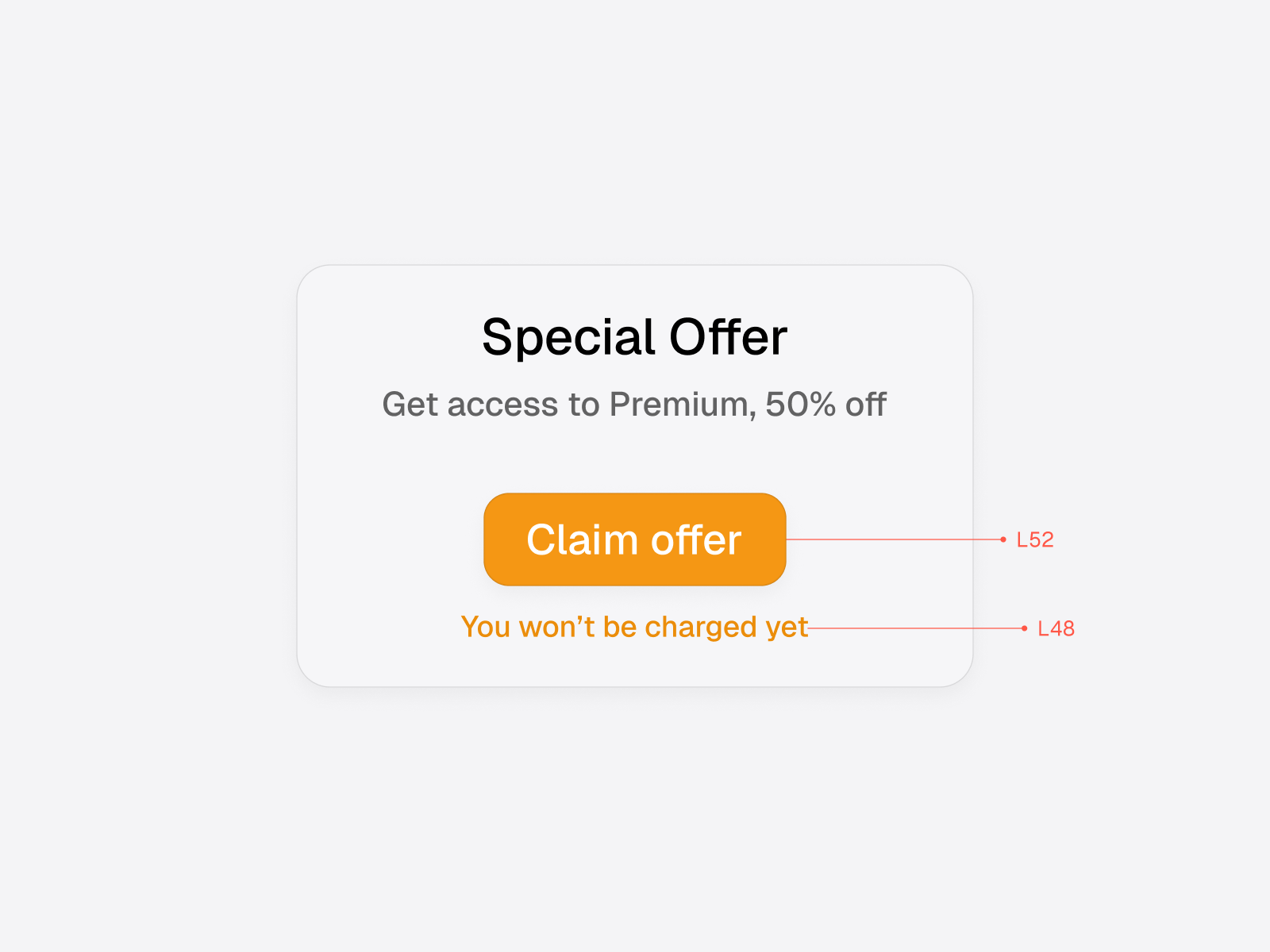
Buttons are the omnipresent component in UI — so it’s important to get them right.
Icons often come with built-in safe areas that add extra space around the actual shape. If you pad the button symmetrically, the icon side can feel too wide.
To counter this extra space, decrease the padding on the icon side. There are many ways to do this, but my preferred method is to wrap the button text in a frame with dedicated padding.
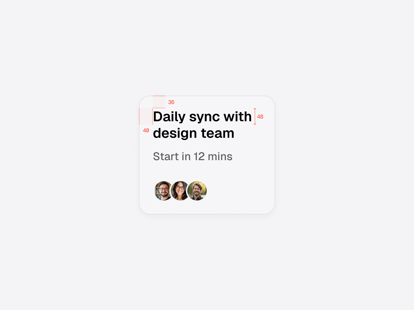
Reducing vertical padding to account for text height
Elements that contain text can benefit from optical adjustment.
Each line of text comes with an invisible bounding box, defined by the line height and the typeface internal height. This adds invisible space above and below the text.
Using symmetrical padding for elements like cards, not accounting for the text height, can make the element look top-heavy.
Reducing the padding slightly on the text side will make the card look optically correct.
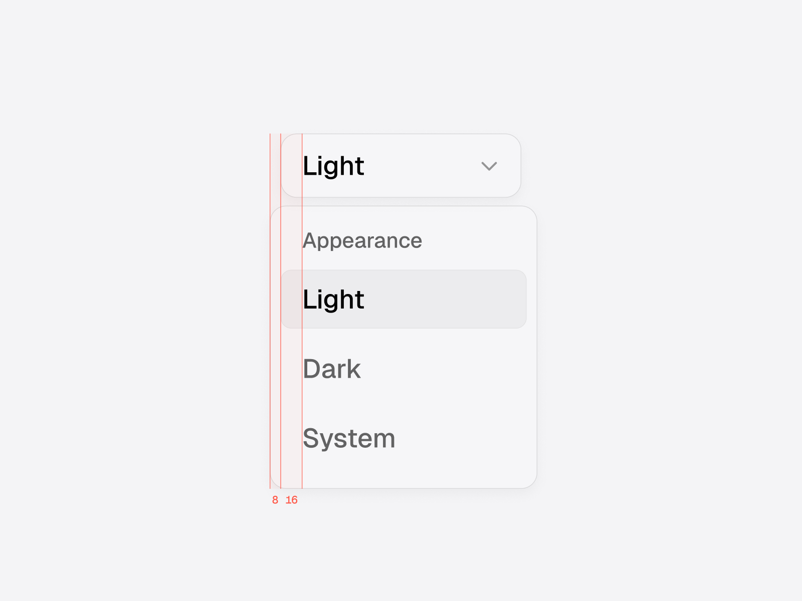
Offsetting dropdowns to align text with trigger
Dropdown menus can benefit from optical adjustment, offsetting it horizontally in relation to the trigger.
To get it right, just offset the dropdown horizontally by an amount equal to its padding. This ensures the text inside the dropdown aligns perfectly with the text in the trigger/button.
For consistency, use the same border radius and height for both the dropdown menu and the trigger.
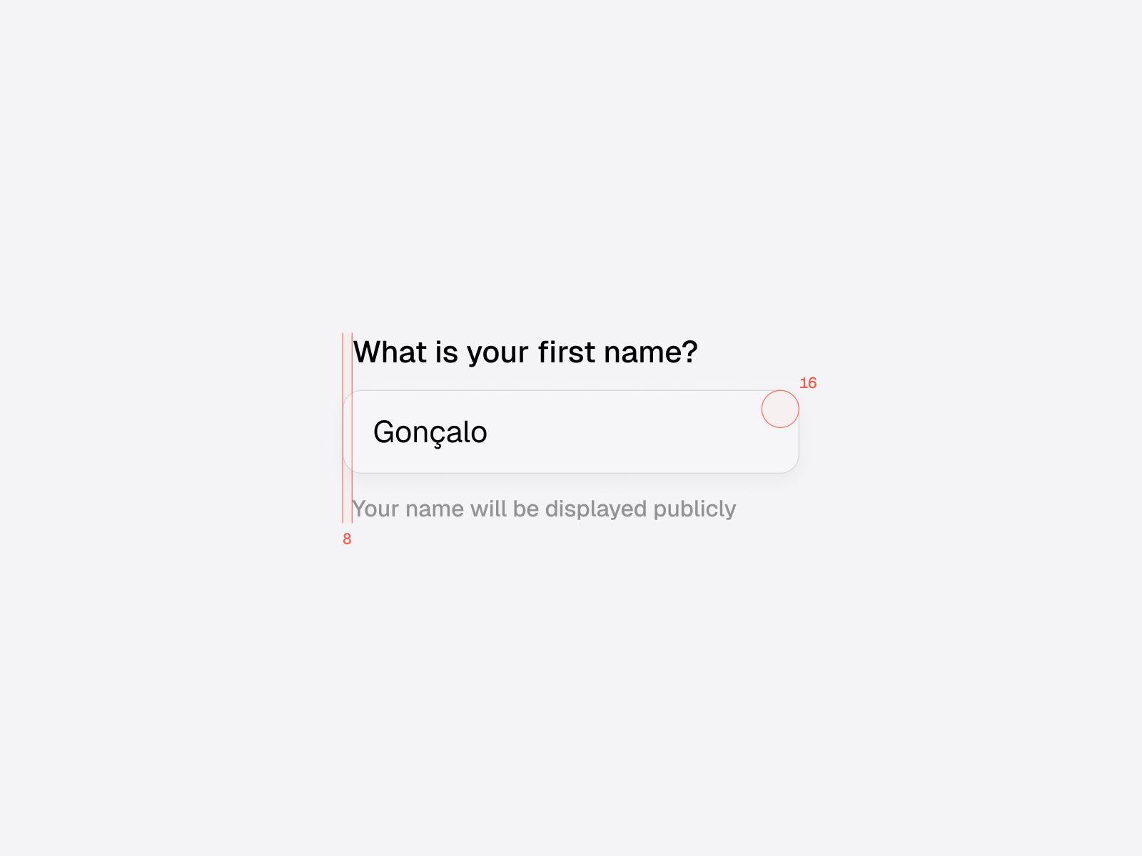
Add subtle horizontal padding for rounded inputs
Input components often include a label above and an optional hint below.
Because the input field is rounded, text aligned directly to the left edge can feel off.
Adding a small amount of horizontal padding (based on the radius of the input field) ensures that labels and hints look properly aligned with the shape of the field.
Adjust color lightness to balance visual weight
Optical adjustments also apply to color, not just spacing.
When two elements sit close together with different visual weights, the heavier one can dominate.
Tweaking the lightness of text or supporting elements can bring them into better harmony and improve legibility.
Trust your eyes more than the math
It’s tempting and comfortable to trust the numbers, rather than the subjective feeling of visual balance. But remember you're designing for humans — with our quirks & perceptual biases.
The calculations software makes are rational, but it cannot take into account the way humans perceive shape, color, and size. Following alignment systems blindly often leads to interfaces that feel rigid or visually awkward.
Make sure to trust your visual instinct, and your interfaces will look & feel more balanced.