
How my website works
January 27, 2025
·0views
Working on a personal website has been my endless side-project. There's always something to improve, a new idea to try, or a nasty bug to fix — but I've decided to finally bring it to life.
While it's somewhat fresh in my head, I wanted to capture how it works, what tools I used to build it, and the challenges I faced along the way.
Hopefully, sharing how I built my personal space can give you ideas on how you can do the same — and inspire you to build your own, personal space too!
Ideas and goals
Before arriving at this solution, I’ve worked through several iterations on what my personal website could have been.
I wanted my website to feel like home — a personal dashboard, a lifelog of what I create, how I think, and a place for exploration.
Ultimately, I've settled on a few guidelines to inform what I should be aiming for, and what I do and do not want my website to be:
I do not want my website to feel like a portfolio
A traditional portfolio site would only show my work. My goal was to create a space that goes beyond that — not only showcase what I do, but also offer a glimpse into my personality, interests, and inspirations.
I want my website to feel like an app
Apps are made from a lot of thought into user experience. They need to be fluid, fast, and encourage exploration. I want my website to incorporate that experience — both from a visual and functional perspective.
I want my website to be easy to update
Having to commit, open a pull request, and rebuild my website every time I want to make a content update is just too much friction. I know from experience I would not do it. So it should be extremely easy and fast to add, edit or delete content.
Design
The core website design revolves around a classic productivity app layout, optimized for both desktop and mobile.
On desktop, a fixed sidebar on the left contains the main navigation and my user profile. The content area on the right takes up the majority of the screen. This sidebar-content structure mimics apps like Notion — matching my goal of providing a familiar, intuitive interface.
On mobile, the sidebar transforms into a bottom tab bar, for improved mobile ergonomics. This tab bar contains the same navigation items for each section of the site.
Typography
I've taken a platform-native approach to typography, that prioritizes familiarity and consistency with each OS.
Instead of choosing a specific typeface, I've opted to use the system UI font. This means the font automatically adapts to the user's operating system:
I feel this is a nice way to make the website feel part of the OS, making it blend seamlessly with the user’s environment and matching the expectation of the experience for each device.
Color
In line with my approach to typography, I've implemented an adaptive color scheme that respects the user's system preferences:
The adaptation from light to dark is done through CSS variables. From a set of primitive tokens (e.g. color-gray-50), I created a mapping to dynamic semantic tokens (e.g. color-background-neutral-subtle) that changes the color applied on each theme.
The full color system includes different tokens for foreground, background, and border colors, following a simplified version of the design token taxonomy of Nathan Curtis.
Frontend
I chose Next.js as the frontend framework for the website. This was a very easy choice — it’s the industry-standard framework for React, has a large community, and extensive documentation.
I opted to go with the App Router, which was introduced in Next.js 14, as well as the recently introduced React Server Components — which means my site can be generated exclusively from the server, reducing client-side load and improving SEO.
I'm also leveraging their Incremental Static Revalidation feature, which is crucial since my content is separate from the codebase — the frontend is fetching all the content from Notion, which acts as the CMS.
All the code is in TypeScript — having strong type checking just makes me feel at ease, and IDE support is just better when you’re using it.
Styling
This was another easy choice — TailwindCSS. It’s my default for every project I start. Utility-first CSS frameworks just click with me, especially when paired with a component-based approach like React.
Apart from the usual styling work, I’m using Tailwind to define my design system. This is done through the tailwind.config.ts file, which incorporates all tokens from my custom-made design system — including size, color, and typography variables.
CMS
This was the hard choice of the stack.
As mentioned earlier, easy content updates were a key requirement for my personal website. To avoid manual rebuilds and deployments for every content update, I had to keep the content separate from the codebase from the start.
I've looked through a couple of CMS options, but all of them had an issue: they required me to be at my laptop. Most my thoughts and ideas happen where I'm not at my laptop. I usually have them when I am walking outside, or travelling. So I needed a way to be able to capture any idea or thought on the move.
This led me to consider using Notion as a CMS. I’m a big fan of Notion. I use it across my personal and professional life, from simple note-taking to extensive database catalogs. So all my data and content is already there — all I needed to do was to bring it in.
Setup
Notion provides a public API and a client for JavaScript. The setup was simple enough.
But as soon as I started creating a few basic functions for content fetching, I noticed some TypeScript magic was going to be needed to make it work. For a beginner TypeScript user like me, it wasn’t easy. Although the Notion client package provides typed API endpoints, I found them to be a pain to work with, and ended up opting out of typing for some parts of the API.
Rendering
After setting up and having content fetching in place, I realized I needed to convert Notion blocks to React elements.
I found quite a few libraries that had already figured this out. But I’m not a fan of introducing dependencies when I can code the functionality myself.
So I decided to build my own Notion to React renderer. Apart from some tough block types (looking at you numbered_list_item), I managed to get it all working with a huge switch statement.
Limitations
Notion brings a set of problems with images. Their file and media type includes an expiry_time field, which is set to 1 hour by default in their API, with no configuration options available.
To address this limitation, I opted to use Cloudflare R2 as a solution for storing and serving images throughout the website — coming up next.
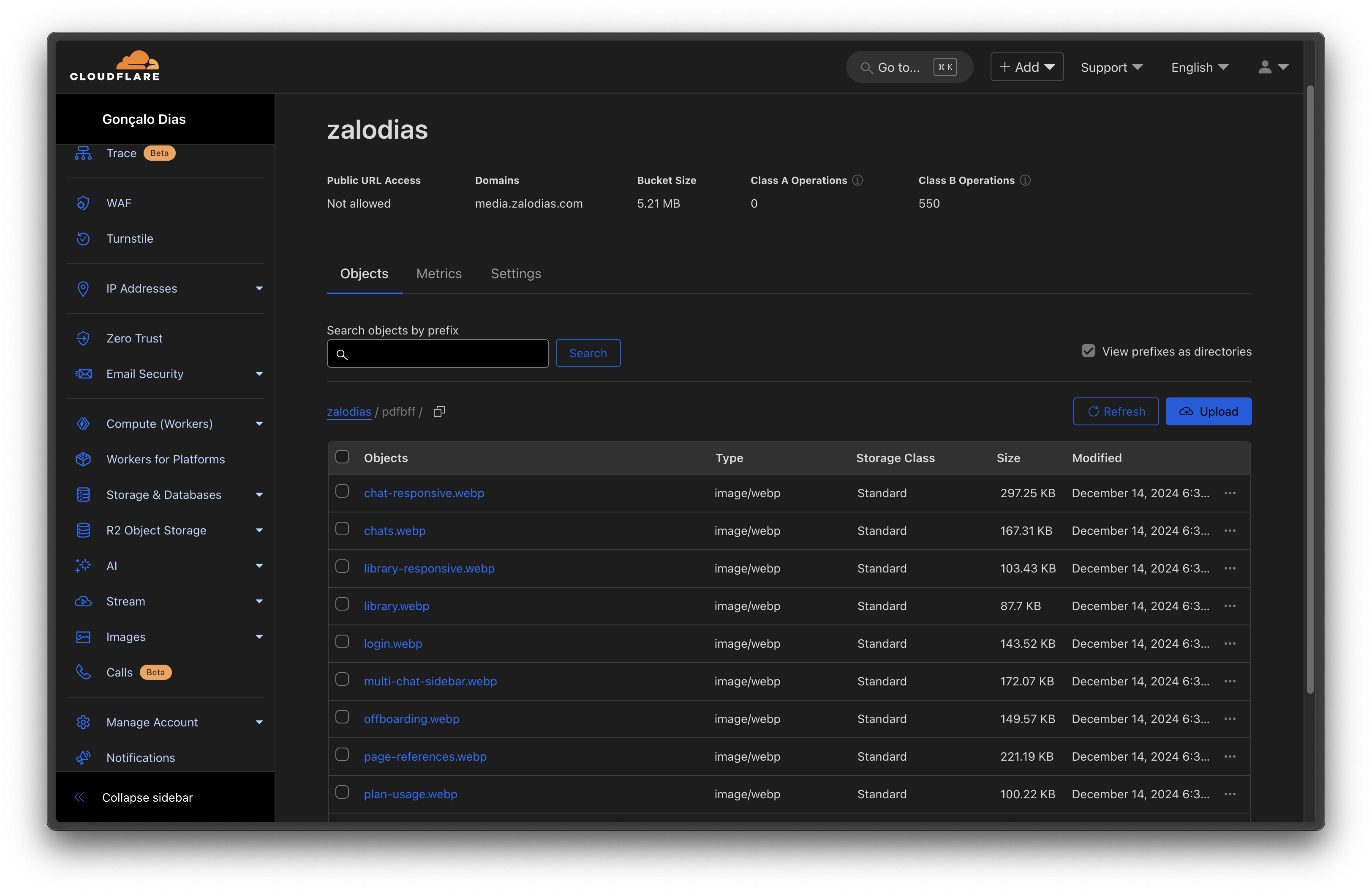
Storage
I've opted to use Cloudflare R2 as the primary storage solution for my website images. I was essentially forced to make this decision when I came across the limitations of Notion's image hosting, which impose a one-hour expiry time on image links.
To deal with this issue, I worked out a simple two-step process:
As an added benefit, I've set up a custom subdomain, media.zalodias.com, to serve these images.
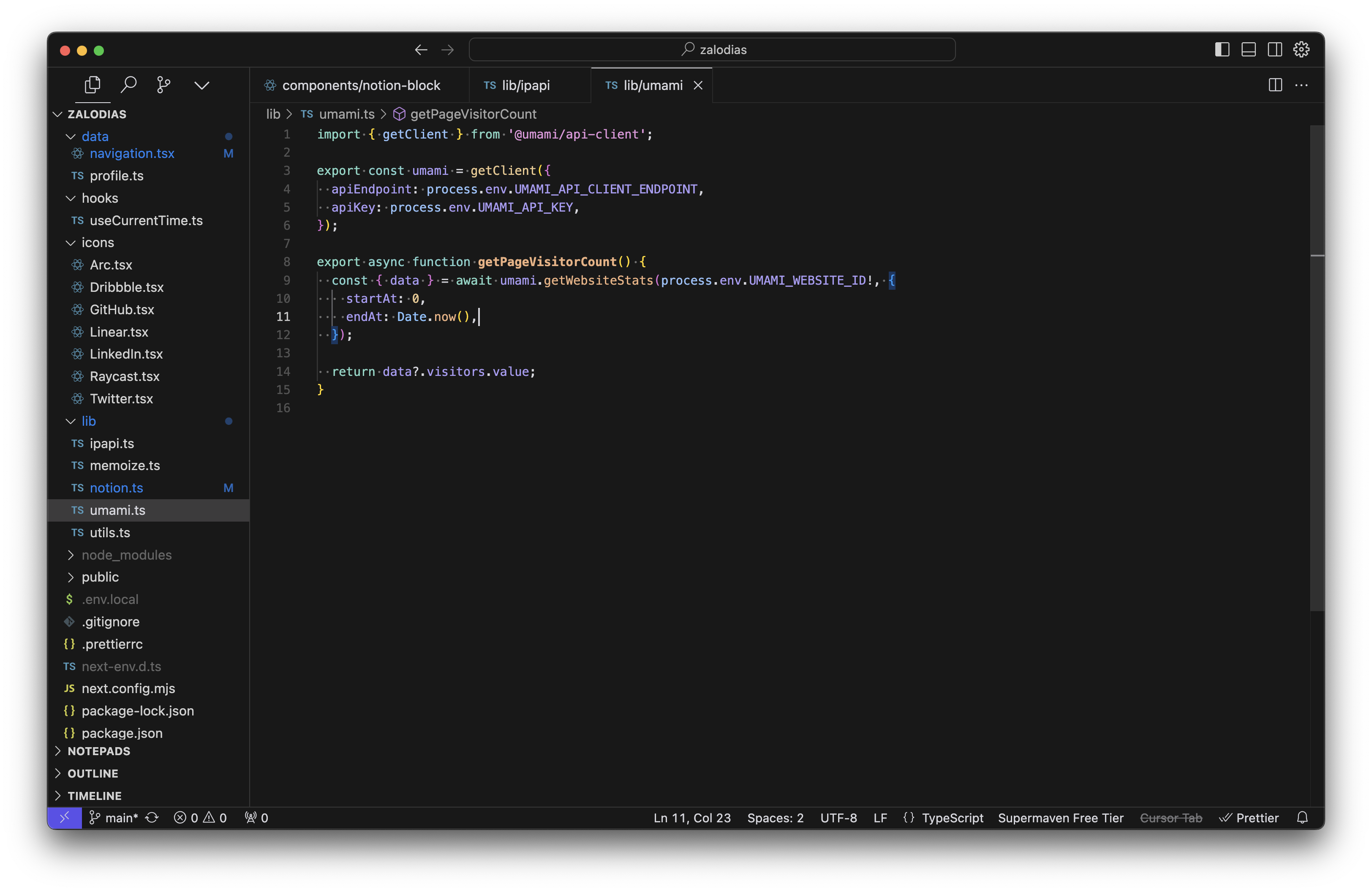
Analytics
I decided to implement some light analytics for doing quick regular checks on my website performance.
I came across Umami a few months ago and really liked their simple approach to analytics. They offer a very generous free plan, which is more than enough for my needs.
Umami operates without collecting personal information — so no annoying cookie banners needed. The implementation was very simple, too:
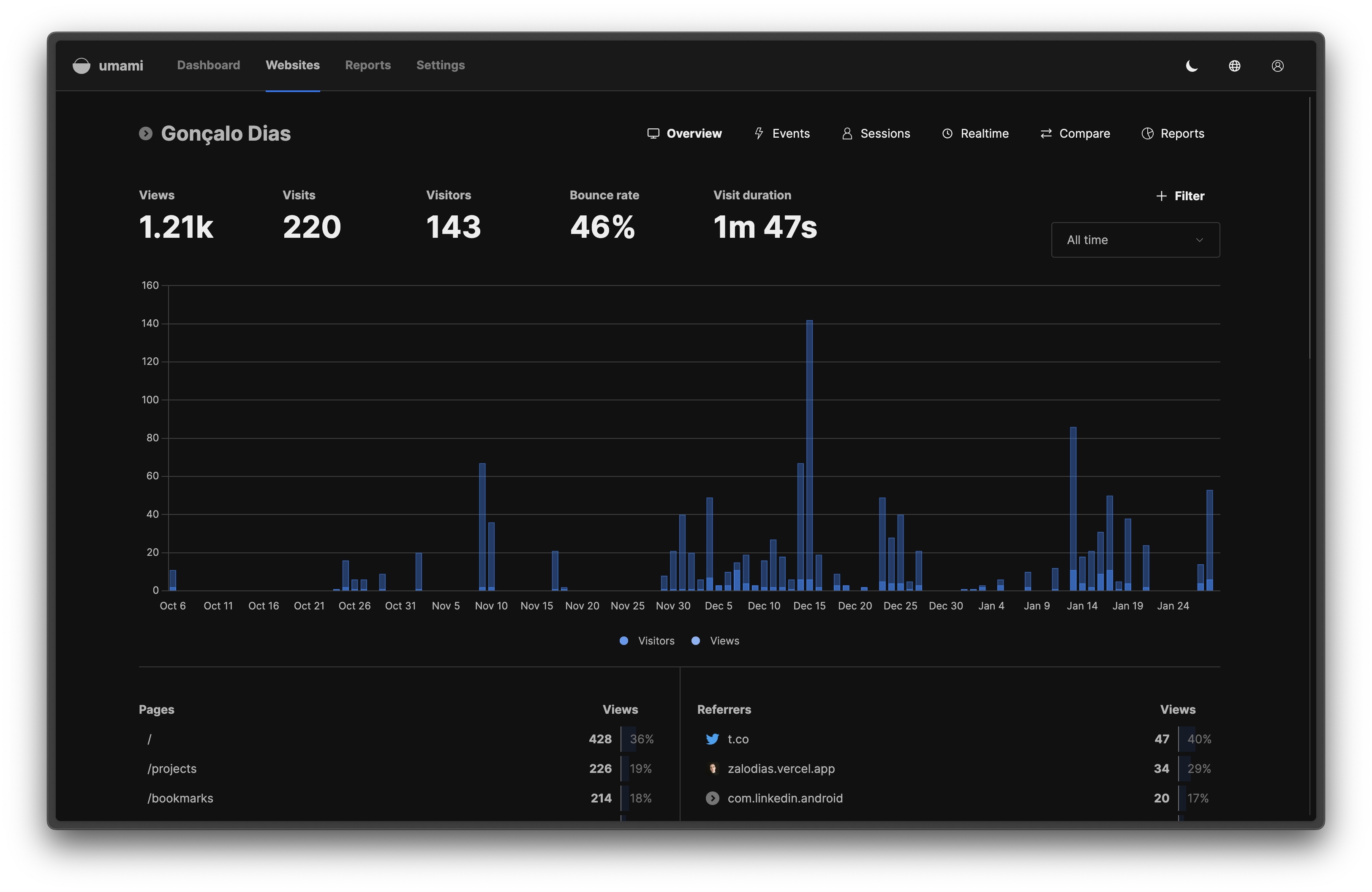
With everything set up in the code, the dashboard went live.
It’s a simple dashboard — just enough to get the information I need about page views, sessions, bounce rate, visit duration, among other metrics.
What’s next
I've poured a few dozen hours into this website over the last few months. My goal is to use this foundation to keep adding incremental improvements and features, and keep sharing more content — both personal and professional.
With that in mind, here are a few things I’m planning to work on next:
Newsletter / Feed
With so much content focused on main social platforms, I think there’s an increasing value for decentralized, personal curated feeds.
So, I would love to have a regular feed of my latest finds, updates, and what I’m working on.
This way you can get to know me better, dive deeper into topics I find interesting, and share your own insights as well!
Playground
I enjoy tinkering with different technologies in my spare time — why not bring these experiments into my personal space?
I want to have a playground where I can experiment with new technologies, interactive demos, and perhaps even some playful AI integrations.
Thinking of it as a digital lab where you can peek over my shoulder as I play with tech.
Audio listening for notes
This is my first note (I’m proud), but I'm planning to release a lot more over the next few months.
After a long day of staring at screens, I find comfort in listening to podcasts or audiobooks. They give my eyes a much-needed break while keeping my mind engaged. I know some other people that feel the same — so why not introduce an audio version of each note for my readers?
I love the idea of narrating my own notes, so you can listen to my thoughts while you're commuting, exercising, or just relaxing with your eyes closed.
AI-powered About page
When I was planning this website, I initially thought about including a standard About page.
But I was wanting something more dynamic and engaging. I started thinking about making it a dialogue, like a conversational AI-powered About experience, where you can ask anything about me and get an answer.
Of course, training an AI model to accurately represent me will be hard. But it’s an opportunity to get my hands dirty with LLMs, and I'm excited to test it out.
You can check out the source code for this website on my GitHub repo. You can also follow along future updates on X. Now, back to 👨💻